
How to choose your brand colours
Think of the most iconic brands you know. You probably think about their colour palette. That’s because it’s the most memorable aspect of a brand. We created an outline that is easy to follow when choosing your colours.
Colours have a strong and instant effect on how we see the world. From warning signs to calming spaces, our brains are wired to react to colour. Which is why choosing them for your brand can be stressful, particularly when you feel unsure about the process behind it.
Because of that, we have created an outline that is easy to follow, as well as noting things to consider when choosing the best colours for your brand.
Why brand colours are important
Research behind colour in branding is extensive. Colour consultants Colorcom collated a lot of research papers and came up with a few key findings:
The first couple of points tell us why it’s important to choose colours that mean something to your target audience, be it donors or beneficiaries. The third point shows how crucial it is to use consistent colours across all brand collaterals and marketing materials.
- 92.6% of people put the most importance on visual factors when purchasing products or giving money.
- People make a subconscious judgement about a brand, person or environment within 90 seconds of initial viewing and between 62% and 90% of that opinion is based on colour alone.
- Colour increases brand recognition by up to 80%.
The first couple of points tell us why it’s important to choose colours that mean something to your target audience, be it donors or beneficiaries. The third point shows how crucial it is to use consistent colours across all brand collaterals and marketing materials.
Main things to consider
Accessibility
The World Health Organization estimates that at least 2.2 billion people live with a near or distance vision impairment. And, according to Colour Blind Awareness, around 300 million people have colour blindness. Accessible colour palettes enable people with visual impairments to experience branding in the way you intend it to be experienced equally.
The number one thing to do to make sure your palette is accessible is to add enough contrast between foreground and background. Once you choose your main palette, you can check its contrast accessibility by using tools such as ContrastChecker and AccessibleColors.
This is something we were particularly careful about when doing our own rebrand back in January 2021.
Appropriateness and colour psychology
Research has found that the way people perceive a brand’s colour is not necessarily linked to whether they personally like the colour or not. It’s mostly about how appropriate the colour is for the brand’s industry and values. For example, a charity that works with children might want to stick to bright and lively colours instead of dark and muted ones. Unless those children have visual impairments, in which case ensuring the appropriate contrast ratio is even more important.
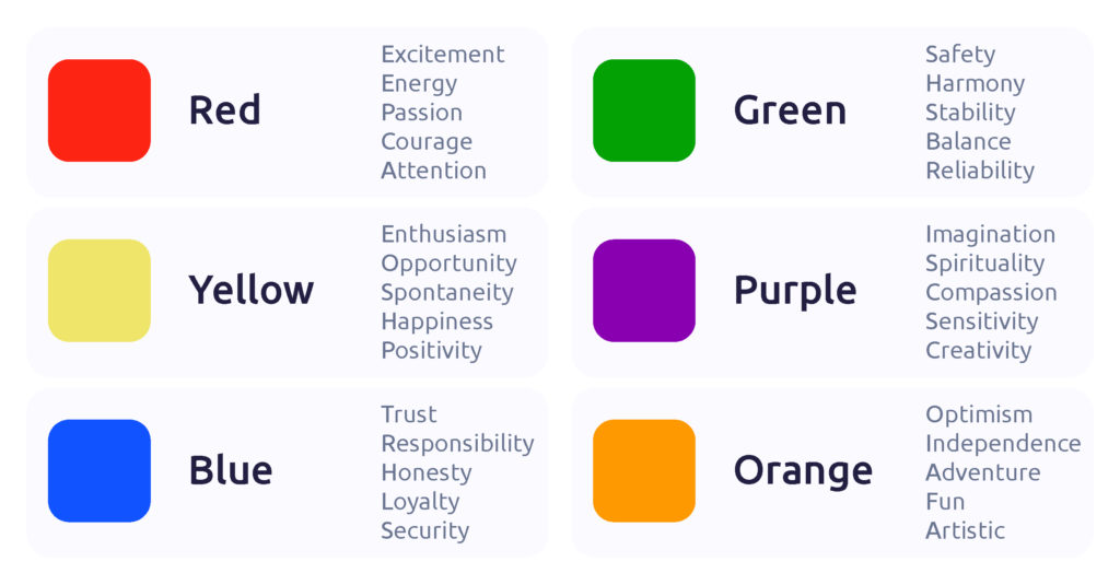
Alongside this, colour psychology studies can also give great guidance on what you want to convey. Although experts haven’t found the exact meaning behind colour because of cultural differences, there are general colour shades that convey certain feelings.
Personality and essence
How do you want your brand to come across? Is your brand reliable and corporate? You can choose darker, serious colours. Is it daring and cheerful? Maybe a brighter palette is for you.
As with messaging, colours require you to think about your brand’s personality and mission.
Creating your palette and testing
There are many great tools out there to create colour palettes once you know the direction you want to go in. We like Accessible Brand Colours, Colormind, Coolors, Adobe Color. Choose a main colour (what you will use most) and then find what works as a secondary palette (accent colours and neutrals).
Once you have your palette, you can get to testing. Create a couple of branding materials, perhaps a printed poster and a social media post, that will let you see how the palette works in different contexts. Ask people you work with what they think and, if it’s available to you, user testing is a fantastic idea as well.
Conclusion
While choosing an appropriate colour palette is one of the most important parts of branding, it doesn’t need to be stressful. First, look into the meanings behind colours. Then choose a few colours after considering what your brand does, who it benefits and its personality. Finally, create your colour palette using a facilitating tool and test it with those around you. It’s okay to take your time during this step in your branding, it’s an important step.
If you have any questions or need guidance, we’re here to help. Contact Us